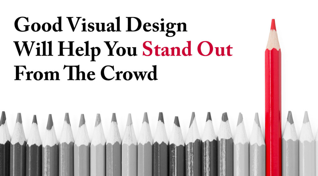
Good Visual Design Will Help You Stand Out From The Crowd
Ms. Pomerantz has served as the Chief Executive Officer of Mary Pomerantz Advertising for the past twenty five years. She was formerly the Chief Executive Officer of Pomerantz Staffing, which grew to be one of the largest privately-owned staffing companies in the US under her leadership.

Good visual design can make a critical impact on the effectiveness of your recruitment advertising efforts and the subsequent quality of your company’s workforce. That’s just one reason why working with a highly-skilled recruitment marketing agency like Mary Pomerantz Advertising can substantially increase both the quantity and quality of candidates you attract for your organization’s open positions. When you work with experienced graphic design professionals your ads, job postings, and related recruitment materials will rise above those of your competitors, attracting the attention of qualified candidates and convincing them to apply to your company’s opportunities.
Visual Design Always Makes an Impact – Positively or Negatively
While good visual design makes a positive impact on its intended audience, poor visual design (or simply the lack of any intentional design choices whatsoever) has the opposite effect. To understand these effects, it can be helpful to imagine a series of ads along a spectrum of design quality. The worst of these ads is the result of a number of poor design decisions, resulting in elements that don’t line up properly, a hodgepodge of different fonts, an ill-conceived color palette, and a confusing and distracting layout. This ad would stand out from the competition – but for all the wrong reasons – leading viewers to have a negative impression of the company it represented and making potential job candidates less likely to apply.

LINES

SHAPES

COLOR PALETTES

TYPOGRAPHY
Source: Usability.gov
The next ad, representing the middle of the design quality spectrum, lacks any distinctive design elements and simply fades into the background of all the other ads surrounding it. This ad is likely to be ignored by at least some potential job seekers whose eyes pass over it in favor of ads that make more of a visual impact. The final ad in this this spectrum is composed of well-thought-out design elements that attract the viewer’s attention and deliver important information clearly and convincingly. This example of good visual design draws in a larger audience and leaves them with a more favorable impression of the company it represents. When you are looking to recruit new employees, this begs the question: which ad do you want as the recruitment “face” of your organization?
Principles of Good Visual Design
So, if we have convinced you of the value of good visual design in your recruitment marketing, how can you ensure that your ads, job postings, web pages, and other recruitment materials will possess the positive visual design elements that produce the best recruitment results? The simple answer is to rely upon the experience and expertise of a team of creative professionals who have been creating successful recruitment advertising for years – like the award-winning team at Mary Pomerantz Advertising. There’s simply no “quick fix” that can replace the advantages of years of training and practical experience in the field. But, there are some basic principles to good visual design that anyone can learn that can help you judge the quality and potential effectiveness of any given graphic design project. I’ll outline some of these principles below to give you a sense of what goes into making any design more successful.
Unity
A design achieves unity when all the elements on a page visually or conceptually appear to belong together. Good visual design must strike a balance between unity and variety to avoid a dull or overwhelming design.
Space
Incorporating empty space into a design helps reduce noise, increase readability, and delineate each section from one another. A lack of space makes a design feel cramped and unprofessional to the reader. Too little empty space is probably the most common “rookie mistake” in visual design.

Hierarchy
While space separates distinct elements, hierarchy gives the reader cues on the relative importance of each element. Designers often create hierarchies through different font sizes, colors, and placement on the page.

Contrast
Contrast involves using color, size, or other characteristics to make certain elements stand out. A common error by non-designers is to try to make everything stand out, but this is the equivalent of highlighting every sentence in a book; it doesn’t achieve the desired objective.
Scale
By creating a range of sizes among elements, the designer can give the reader information about how each element relates to one another, based upon their relative sizes. [1]
Overcoming Obstacles and Working within Constraints
In a perfect world, a skilled graphic designer could use all of these principles to create the optimal visual design for each and every one of your recruitment ads, postings, or materials. However, oftentimes there are constraints that limit the scope and scale of possible designs. For some media there are limits to the types of elements that can be employed. These could include color choices, the overall size of the piece, layout constraints, or simply the costs associated with different design choices (e.g. the size of print ads or the cost of “extras” in online job postings).

This is another area where a team of experienced recruitment marketing professionals can help you out tremendously. At Mary Pomerantz Advertising our creative team is used to working within constraints such as limited space and tight budgets, enabling us to always maximize the recruitment results for our clients whatever the obstacles or constraints of any given media. We aren’t some creative prima donnas who will oversell you on unnecessary “bells and whistles” that aren’t cost-effective or appropriate. We have extensive experience in harnessing our creative expertise to your ultimate goal: recruiting the best possible candidates in the most cost-effective manner.
Stand out from the Crowd with Good Visual Design
Recruiting the best possible workforce for your organization is the most effective way that you can ensure your success in the years ahead. That’s why it is critical that you take advantage of every available option to distinguish yourself from the competition in today’s increasingly tight employment market for highly-skilled employees. Good visual design in your recruitment efforts is one way that you can differentiate your organization from your competitors – so why not take advantage of it? The design team at Mary Pomerantz Advertising would be happy to lend their experience and expertise to your recruitment efforts. If you’re ready to stand out from the crowd of organizations looking to recruit new employees, give us a call at 732-214-9660 now!

